Crafting New Classics Today
Positype is an independent type foundry founded by Neil Summerour in 2000. Operating out of a home studio in a small, quiet suburb in Georgia, one of the more quietly ambitious type libraries in the world has been built. Over 210 typeface families and counting. Independently owned, creatively directed, and selectively built with a small circle of trusted collaborators whose contributions have shaped some of the foundry’s most important work.
All of it rests on a simple conviction: that typefaces should be useful and reliable, and should carry genuine craft, not only in the broad strokes but in the details most people never consciously notice. The subtleties of mass, the warmth of an imperfect curve, the decisions that separate a font that works from one that resonates. These aren't abstractions. They’re the job.
The catalog spans the full spectrum: from understated workhorse text faces to expressive display families, refined serifs to complex scripts. The retail library covers Latin, Arabic, Khmer, Thai, Korean, Cyrillic, Greek, Japanese, and more. Designing across writing systems at this scale, as an independent foundry, is unusual. It demands a deep, sustained commitment to research, consultation, and technical precision across every script. That commitment is what every release is built on.
Custom typeface work has included projects for the NFL, the New York Jets, RedVentures, Oculus/Meta, Facebook, Victoria's Secret, L’Oreal, Revlon, the Girl Scouts of the USA, the US Postal Service, the BBC, David Bowie, Panera, Audible, and others. Each brought its own constraints, its own requirements, its own opportunities.
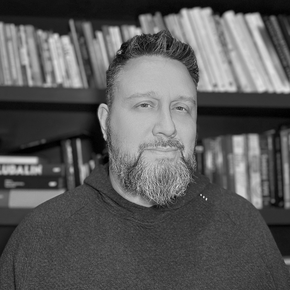
Neil Summerour builds type that feels human. A type designer, lettering artist, and calligrapher, he founded the independent foundry Positype on a single stubborn conviction: that letters should carry warmth, voice, and intent, and should be made to do something specific rather than simply exist. He would rather be left to the quiet of the work than stand in front of it. He shows up for the type community, but he lets the fonts do the talking.
That conviction has carried the work somewhere unusual for an independent foundry: deep into the world's writing systems. The catalog now runs to more than 210 families, and Neil actively works across ten writing systems, pushing himself to learn more, share more, and find opportunities for designers on both sides of the screen. To him, inclusive type is not a feature but a responsibility. It is patient, exacting work, and it holds up. Six Type Directors Club Certificates of Typographic Excellence, eight Communication Arts Awards of Excellence, the 2012 People's Choice Award at the Morisawa Type Design Competition, and the trust of the NFL, Meta, Audible, the BBC, the Girl Scouts of the USA, and Wells Fargo all trace back to the same standard. He serves as Chair of the Society of Typographic Aficionados, but the measure he actually cares about is quieter: type that meets a real need and reads like it was made by a human, for humans.
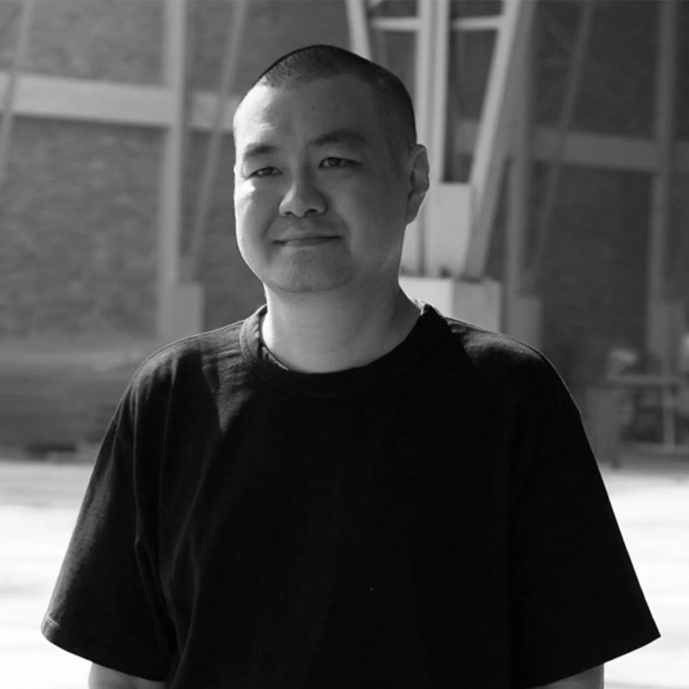
Potch is a type designer based in Bangkok. He marked a turning point for typeface projects by Huai which have been recognized by well-known type design competitions. While attending the Maryland Institute College of Art (MICA) for MFA Graphic Design in 2016, Potch created a remarkable process-based typeface design research ‘State’ for the dissertation and became even more passionate about the letterform after graduation. This passion manifested itself in the completion of the Type@Cooper Extended Program in 2018.
Potch’s typefaces have been honored by the Type Directors Club, Art Director Club, STA Chicago, Morisawa Type Design Competition, amongst many others.
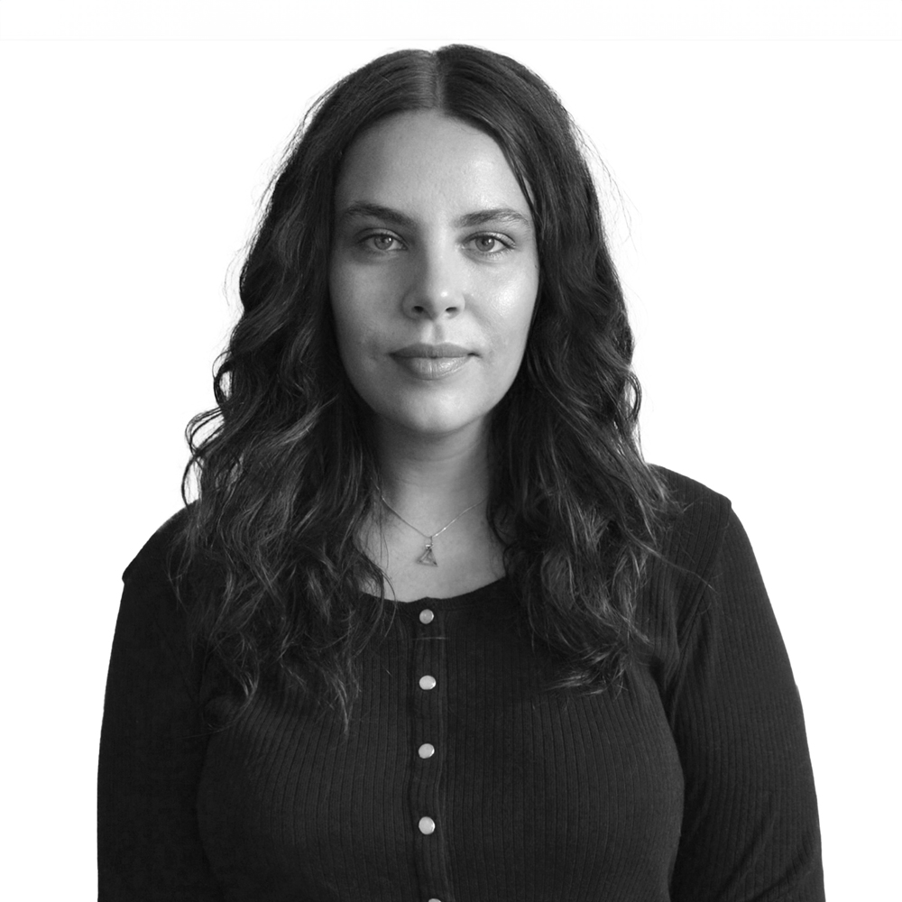
Shauna Mae Hartsook is a graphic designer and lettering artist based in western Canada. A graduate of the Alberta College of Art and Design, Shauna fell in love with type and dedicated herself to honing her lettering and typographic skills ever since. She embarked on a transformative journey in 2016 at the incredible Type@Paris, where she crafted her first typeface, "Sans Français". When she's not busy crafting memes, you'll find Shauna exploring the Rocky Mountains or hunting for type inspiration at antique markets.