Human Sans


Human Sans is a humanist sans serif years in the making, built from the ground up to serve as a true typographic workhorse. The typeface began as an evolution of an earlier Positype design but was drawn and redrawn, crafted and recrafted until every decision was resolved on its own terms.
Three widths are provided: Standard, Narrow, and Condensed. The Narrow width occupies the practical middle ground where condensed is too tight and standard carries too much horizontal presence. Eight weights from Light to Ultra with matching italics span each width.
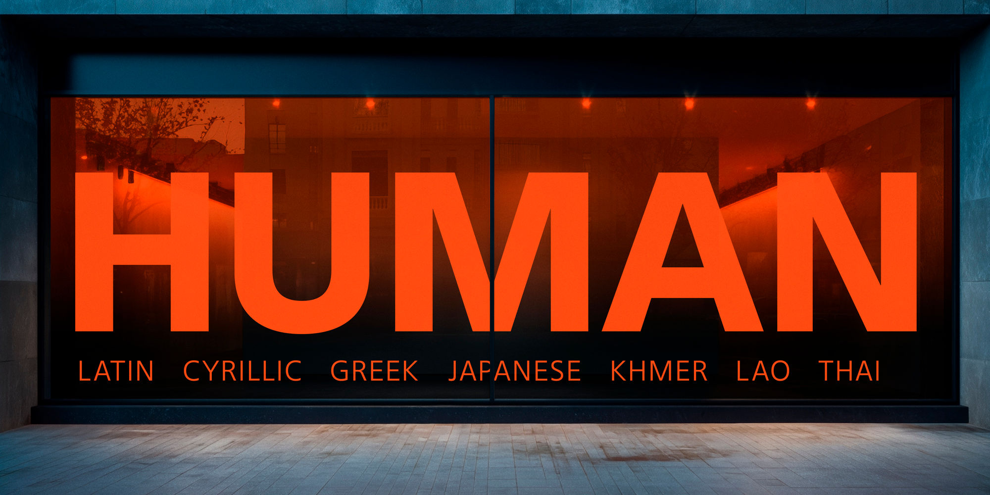
Writing system support covers Latin, Cyrillic, Greek, Japanese, Khmer, Lao, and Thai, with all writing systems besides Japanese available in all three widths. The Japanese extension is a fully realized offering: complete JIS X 0208 Level 1 and Level 2 coverage at 6,707 kanji, full hiragana and katakana, halfwidth katakana, vertical typesetting with vert, vrt2, and vkna features, halt and palt for automatic punctuation spacing, proportional kana widths, and contextual half-width spacing. This is not a limited kanji subset or a Latin family with Japanese characters appended to it. It is a complete Japanese typeface built to the same standard that Japanese typographers expect from domestic foundries. The Khmer extension was built with a complete OpenType shaping pipeline. Human Sans is designed to work across languages, not as an afterthought but as a foundational principle.